Ted Bahr has the coolest art store on Long Island: The Bahr Gallery.

Ted is the “B” of BZ Media – and I’m the “Z.” We’ve worked together, off and on, since the early 1990s, beginning at Miller Freeman in San Francisco. We started BZ Media together in 1999, starting such iconic media properties as SD Times and the SharePoint Technology Conference. I left in 2013, and we’re in the process of winding the company down.

And now Ted (in the blue blazer) has opened the Bahr Gallery in beautiful Oyster Bay – ironically, only a few doors away from BZ Media’s first office space.

We don’t sell posters. We sell Art.

The late 1960’s hosted a unique utopian experiment where love, peace, music, free living and mind expansion opened up whole new worlds, and nowhere was this creative explosion more acute and more wild than in San Francisco.

The psychedelic posters created from 1966-1969 by masters like Wes Wilson, Stanley Mouse, Victor Moscoso, Rick Griffin, and Alton Kelley have become recognized and highly valued for their unique and creative expression of this utopian time in history, before, during and after the Summer of Love.

The Bahr Gallery promotes and sells this Art, placed in historical context, for you to put on your wall and enjoy. All pieces are beautifully hand-framed and matted with enhancement of the artwork in mind and behind the highest quality museum glass.

Certificates of authenticity and official quality grading documentation is included where available.

Virtually all pieces are first editions, printed before the concert occurred. Many are signed by artist and/or performers. Much of this art currently hangs in the Smithsonian, Metropolitan Museum of Art, MOMA, The Louvre, the deYoung and other leading museums and institutions all around the world.

The Bahr Gallery has several rooms featuring more than 60 psychedelic master works on rotation from the Big Five and other artists. Open hours vary with the season but generally we are open on weekends – we are also open by appointment, so please contact us for a private viewing.

Read an interview with Ted in the Long Island Herald, or follow the gallery on Facebook. And now you know where to shop next time you’re in the neighborhood. It’s totally groovy.

You are not the user. If you are the CEO, CTO, chief network architect, software developer – you aren’t the user of the software or systems that you are building, or at least, you aren’t the primary user. What you are looking for isn’t what your customer or employee is looking for. And the vocabulary you use isn’t the vocabulary your customer is using, and may not be what your partners say either.

Two trivial examples:

  1. I recently had my hair cut, and the stylist asked me, “Do you need any product?” Well, I don’t use product. I use shampoo. “Product” is stylist-speak, not customer-speak.
  2. For lunch one day, I stopped at a fast-food chain. Yes, yes, I know, not the healthiest. When my meal was ready, I heard over the speaker, “Order 143, your order is up.” Hmm. Up? In customer-speak, it should have been, “Your order is ready.”

In the essay, “You Are Not the User: The False-Consensus Effect,” Raluca Budiu observes:

While many people who earn a living from developing software will write tons of programs to make their own life easier, much, if not most, of their output will in fact be intended for other people — people who are not working in a cubicle nearby, or not even in the same building. These “users” are usually very different than those who write the code, even in the rare case where they are developers: they have different backgrounds, different experiences with user interfaces, different mindsets, different mental models, and different goals. They are not us.

Badiu defines the false-consensus effect as, “The false-consensus effect refers to people’s tendency to assume that others share their beliefs and will behave similarly in a given context.” And that is more than designing cool software. Good design, and avoiding a false consensus, requires real-life situations with real-life customers or end users.

The way I navigate a grocery store is not the way that the store’s designer, or store’s manager, navigates it. It’s certainly not the way that the store’s manager navigates it. Or its chief risk officer. That’s why grocery stores spend a fortune observing users and testing different layouts to not only maximize sales and profitability, but also maximize the user’s satisfaction. A good design often requires a balance between the needs of the designer and the needs of the users.

My wife was recently frustrated when navigating an insurance company’s website. It was clearly not designed for her use case. Frankly, it’s hard to imagine anyone being satisfied with that website. And how about the process of logging into a WiFi network in a hotel, airport, or coffee shop? Could it be more difficult?

Focus on the User Experience

The Nielsen Norman Group, experts in usability, have offered a list of “10 Usability Heuristics of User Interface Design.” While Jakob Nielsen is focused on the software user experience, these are rules that we should follow in many other situations. Consider this point:

Match between system and the real world: The system should speak the users’ language, with words, phrases and concepts familiar to the user, rather than system-oriented terms. Follow real-world conventions, making information appear in a natural and logical order.

Yes, and how about

Help users recognize, diagnose, and recover from errors: Error messages should be expressed in plain language (no codes), precisely indicate the problem, and constructively suggest a solution.

That’s so familiar. How many of us have been frustrated by dialog boxes, not knowing exactly what will happen if we press “Cancel” or “Okay”?

Design Thinking

The article “Design Thinking” from Sarah Gibbons talks about what we should do when designing systems. That means getting them in front of real people:

Prototype: Build real, tactile representations for a subset of your ideas. The goal of this phase is to understand what components of your ideas work, and which do not. In this phase you begin to weigh the impact vs. feasibility of your ideas through feedback on your prototypes.

Test: Return to your users for feedback. Ask yourself ‘Does this solution meet users’ needs?’ and ‘Has it improved how they feel, think, or do their tasks?’

Put your prototype in front of real customers and verify that it achieves your goals. Has the users’ perspective during onboarding improved? Does the new landing page increase time or money spent on your site? As you are executing your vision, continue to test along the way.

Never forget, you are not the user.

A fascinating website, “How Did Arizona Get its Shape?,” shows that continental expansion in North America led to armed conflicts with Native American groups. Collectively known as the American Indian Wars, the conflicts began in the 1600s, and continued in various forms for the next several centuries. Multiple conflicts occurred during the U.S.-Mexican War, as westward expansion led to draconian policies levied by the United States against Indian nations, forcibly removing them from their homelands to make way for U.S. settlers.

Less than 15 years after the conflict with Mexico, the Civil War broke out between the United States (the Union) and the 11 states that seceded to form the Confederate States of America. Had the Confederacy won the war, Arizona would have been a slave state oriented to the south of New Mexico rather than to the west.

During the Civil War, in 1863, President Abraham Lincoln signed the Arizona Organic Act, which split Arizona and New Mexico into separate territories along the north-to-south border that remains today. The Act also outlawed slavery in Arizona Territory, a critical distinction as the question of whether new states or territories would allow slavery dominated U.S. westward expansion policies.

Check out the website – great maps!!

Low-Quality Tools at Ridiculous Prices!


Still no pastrami sandwich. Still no guinea pig. What’s the deal with the cigarette?
I installed iOS 11.1 yesterday, tantalized by Apple’s boasting of tons of new emoji. Confession: Emoji are great fun. Guess what I looked for right after the completed software install?

Many of the 190 new emoji are skin-tone variations on new or existing people or body parts. That’s good: Not everyone is yellow, like the Simpsons. (If you don’t count the different skin-tone versions, there are about 70 new graphics.)

New emoji that I like:

  • Steak. Yum!
  • Shushing finger face. Shhhh!
  • Cute hedgehog. Awww!
  • Scottish flag. Och aye!

What’s still stupidly missing:

  • Pastrami sandwich. Sure, there’s a new sandwich emoji, but it’s not a pastrami sandwich. Boo.
  • There’s a cheeseburger (don’t get me started on the cheese top/bottom debate), but nothing for those who don’t put cheese on their burgers at all. Grrrr.
  • Onion rings. They’ve got fries, but no rings. Waah.
  • Coffee with creamer. I don’t drink my coffee black. Bleh.
  • Guinea pig. That’s our favorite pet, but no cute little caviidae in the emoji. Wheek!

I still don’t like the cigarette emoji, but I guess once they added it in 2015, they couldn’t delete it.

Here is a complete list of all the emoji, according to PopSugar. What else is missing?

It’s hard to know which was better: The pitch for my writing about an infographic, or the infographic itself.
About the pitch: The writer said, “I’ve been tasked with the job of raising some awareness around the graphic (in the hope that people actually like my work lol) and wondered if you thought it might be something entertaining for your audience? If not I completely understand – I’ll just lose my job and won’t be able to eat for a month (think of my poor cats).” Since I don’t want this lady and her cats to starve, I caved.

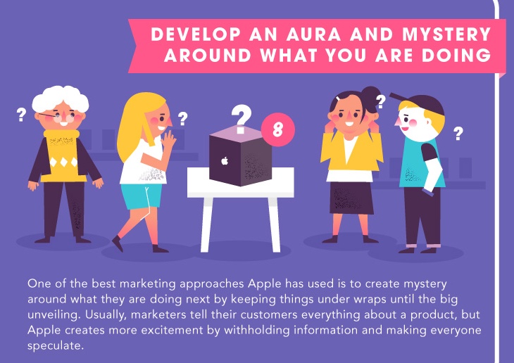
If you like the pitch, you’ll enjoy the infographic, “10 Marketing Lessons from Apple.” One piece from it is reproduced above. Very cute.

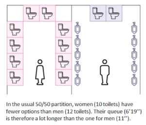
People Queue Magazine has a fascinating new article, “No more queuing at the ladies’ room.” You’ll want to read the whole thing, because it has some fascinating mathematics (this is a scientific article, not a sociological one). Here’s a teaser:

Although it’s a well-documented fact that women have to wait longer at the bathroom stall, so far the mathematical perspective seems to be lacking in literature. This is in spite of the decennia-long existence of the field of queuing theory, which has traditionally been applied most to problems of technology and decent people, rather than to such inescapable habits as the act of excreting.

Nevertheless, mathematics is what you need to analyze queues because of the inherent random nature of queuing phenomena, turning simple lines of people into complex nonlinear systems with numerous parameters, whereby a small deviation can lead to excessive additional waiting. This is as opposed to good old linear systems, which see linear changes of parameters translated in proportional variations at their output.

Nonlinear systems are common in everyday life and nature. A virus for example will result in a pandemic much faster if it is just slightly more infectious. And just a few extra cars make for a traffic jam appearing out of thin air. Similarly, toilet queues, or any queue for that matter, pose nonlinear problems in which the fragile balance between capacity and demand can be disrupted by subtle tweaks.

A first factor explaining why women wait longer is that the net number of toilets for women is smaller than that for men. The toilet sections for men and women are often of equal size, as is the surface dedicated to each of them. What appears to be “fair” at first sight, is quite unreasonable knowing that a toilet cabin inevitably takes up more space than a urinal. Overall, an average toilet area can accommodate 20 to 30% more toilets for men (urinals + cabins) than for women.

The major impact of the number of toilets on the average waiting time can be understood from the Erlang-C queuing model. This model allows to calculate the average waiting time when the number of available toilets, the average time spent on the toilet and the average arrival intensity are known. Where λ stands for the average arrival intensity expressed in number of arrivals per minute, μ for the inverse of the average time spent on the toilet, and t for the number of toilets, the average waiting time is obtained from following formulas:

Read the whole article — and there’s no waiting, whether you are male or female.

Virtual reality and augmented reality are the darlings of the tech industry. Seemingly every company is interested, even though one of the most interested AR products, Google Glass, crashed and burned a few years ago.

What’s the difference?

  • Virtual reality (VR) is when you are totally immersed in a virtual world. You only see (and hear) what’s presented to you as part of that virtual world, generated by software and displayed in stereo goggles and headphones. The goggles can detect motion, and can let you move around in virtual world. Games and simulations take place in VR.
  • Augmented reality (AR) means visual overlays. You see the real world, with digital information superimposed on it. Google Glass was AR. So, too, are apps where you aim your smartphone’s camera at the sky, and the AR software overlays the constellations on top of the stars, and shows where Saturn is right now. AR also can guide a doctor to a blood clot, or an emergency worker away from a hot wire, or a game player to a Pokemon character in a local park.

Both AR and VR have been around for decades, although the technology has become smaller and less expensive. There are consumer-oriented devices, such as the Oculus, and many professional systems. Drivers for the success of AR and VR are more powerful computing devices (such as smartphones and game consoles), and advances in both high-resolution displays and motion sensors for goggles.

That doesn’t mean that AR/VR are the next Facebook or Instagram, though both those companies are looking at AR/VR. According to a study, “VR/AR Innovation Report,” presented by the UBM Game Network, VR’s biggest failures include a lack of subsidized hardware enterprise applications, and native VR experiences. The gear is too expensive, developers say, and manufacturers are perceived to have failed in marketing VR systems and software.

Keep that airsick bag handy

It’s well known that if the VR hardware doesn’t work exactly right. If image motion is not properly synchronized to head motion, many VR users experience nausea. That’s not good. To quote from the UBM study:

Notably, we saw that many still feel like VR’s greatest unsolved problem is the high risk of causing nausea and physical discomfort.

“The biggest issue is definitely the lack of available ‘simulator sickness’ mitigation techniques,” opined one respondent. “Since each VR application offers a unique user experience, no one mitigation technique can service all applications. Future designs must consider the medium/genre they are developing for and continue to investigate new mitigation techniques to ensure optimal user enjoyment.”

Lots of good applications

That doesn’t mean that VR and AR are worthless. Pokemon Go, which was a hit a few summers ago, demonstrated that AR can engage consumers without stereo goggles. Google Earth VR provides immersive mapping experiences.

The hardware is also moving forward. A startup in Helsinki, called Varjo, made a breakthrough in optimizing goggles for AR and VR. They are addressing the challenge that if you make the resolution low on the goggles so that you can refresh the image quickly, it doesn’t look realistic. But if you increase the resolution to match that of the human eye, it’s harder to drive the image seamlessly in real time.

Varjo’s answer is to see where the eye is looking – using a technology called gaze tracking – and seamlessly drive that part of the display in super-high resolution. Where you’re not looking? That can be at a lower resolution, to provide context. Varjo says they can shift the high-resolution spot as fast as you can move your eye – and by tracking the gaze on both eyes, they can see if you are looking at virtual objects “close” or “far away.” The result, Varjo claims, is a display that’s about 35x higher resolution than other commercial systems, without nausea.

Varjo is focusing on the professional marketing with headsets that will cost thousands (not hundreds) of dollars when they ship at the end of 2017. However, it shows the promise of realistic, affordable AR/VR technology. Augmented reality and virtual reality are becoming more real every day.

The folks at Varjo think they’re made a breakthrough in how goggles for virtual reality and augmented reality work. They are onto something.

Most VR/AR goggles have two displays, one for each eye, and they strive to drive those displays at the highest resolution possible. Their hardware and software takes into account that as the goggles move, the viewpoint has to move in a seamless way, without delay. If there’s delay, the “willing suspension of disbelief” required to make VR work fails, and in some cases, the user experiences nausea and disorientation. Not good.

The challenge come from making the display sufficiently high resolution to allow the user to make objects look photorealistic. That lets user manipulate virtual machine controls, operate flight simulators, read virtual text, and so-on. Most AR/VR systems try to make the display uniformly high resolution, so that no matter where the user looks, the resolution is there.

Varjo, based in Finland, has a different approach. They take advantage of the fact that the rods and cones in the human eye sees in high resolution in the spot that the eye’s fovea is pointing at – and much lower elsewhere. So while the whole display is capable of high resolution, Varjo uses fovea detectors to do “gaze tracking” to see what the user is looking at, and makes that area super high resolution. When the fovea moves to another spot, that area is almost instantly bumped up to super high resolution, while the original area is downgraded to a reduced resolution.

Sound simple? It’s not, and that’s why the initial Varjo technology will be targeted at professional applications, like doctors, computer-aided design workers, or remote instrument operators. Prototypes of the goggles will be available this year to software developers, and the first products should ship to customers at the end of 2018. The price of the goggles is said to be “thousands, not tens of thousands” of dollars, according to Urho Konttori, the company’s founder. We talked by phone; he was in the U.S. doing demos in San Francisco and New York, but unfortunately, I wasn’t able to attend one of them.

Now, Varjo isn’t the first to use gaze tracking technology to try to optimize the image. According to Konttori, other vendors use medium resolution where the eye is pointing, and low resolution elsewhere, just enough to establish context. By contrast, he says that Varjo uses super high resolution where the user looks, and high resolution elsewhere. Because each eye’s motion is tracked separately, the system can also tell when the user is looking at objects close to user (because the eyes are at a more converged angle) or farther away (the eyes are at a more parallel angle).

“In our prototype, wherever you are looking, that’s the center of the high resolution display,” he said. “The whole image looks to be in focus, no matter where you look. Even in our prototype, we can move the display projection ten times faster than the human eye.”

Konttori says that the effective resolution of the product, called 20/20, is 70 megapixels, updated in real time based on head motion and gaze tracking. That compares to fewer than 2 megapixels for Oculus, Vive, HoloLens and Magic Leap. (This graphic from Varjo compared their display to an unnamed competitor.) What’s more, he said the CPU/GPU power needed to drive this display isn’t huge. “The total pixel count is less than in a single 4K monitor. you need roughly 2x the GPU compared to a conventional VR set for the same scene.”

The current prototypes use two video connectors and two USB connectors. Konttori says that this will drop to one video connector and one USB connector shortly, so that the device can be driven by smaller professional-grade computers, such as a gaming laptop, though he expects most will be connected to workstations.

Konttori will be back in the U.S. later this year. I’m looking forward to getting my hands (and eyes) on a Varjo prototype. Will report back when I’ve actually seen it.

Prepare to wait. And wait. Many Windows 10 users are getting ready for the Creators Update, due April 11. We know lots of things about it: There will be new tools for 3D designing, playing 4K-resolution games, improvements to the Edge browser, and claimed improvements to security and privacy protections.

We also know that it will take forever to install. Not literally forever. Still, a long time.

This came to mind when my friend Steven J. Vaughan-Nichols shared this amusing image:

Who could be surprised, when the installation estimation times for software are always ludicrously inaccurate? That’s especially true with Windows, which routinely requires multiple waves of download – update – reboot– download – update – reboot– download – update – reboot – rinse and repeat. That’s especially true if you haven’t updated for a while. It goes on and on and on.

This came to the fore about three weeks ago, when I decided to wipe a Windows 10 laptop in preparation for donating it to a nonprofit. It’s a beautiful machine — a Dell Inspiron 17 — which we purchased for a specific client project. The machine was not needed afterwards, and well, it was time to move it along. (My personal Windows 10 machine is a Microsoft Surface Pro.)

The first task was to restore the laptop to its factory installation. This was accomplished using the disk image stored on a hidden partition, which was pretty easy; Dell has good tools. It didn’t take long for Windows 10 to boot up, nice and pristine.

That’s when the fun began: Installing Windows updates. Download – update – reboot– download – update – rinse – repeat. For two days. TWO DAYS. And that’s for a bare machine without any applications or other software.

Thus, my belief in two things: First, Windows saying 256% done is entirely plausible. Second, it’s going to take forever to install Windows 10 Creators Update on my Surface Pro.

Good luck, and let me know how it goes for you.

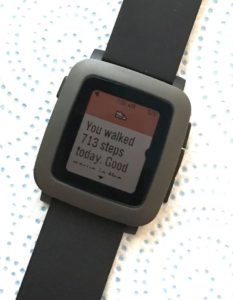
“You walked 713 steps today. Good news is the sky’s the limit!”

Thank you, Pebble, for that encouragement yesterday.

The problem with fitness apps in smartwatches is that you have to wear the watch for them to work. When I am at home, I never wear a watch. Since I work from home, that means that I usually don’t have a watch on my wrist. And when I go out, sometimes I wear the Pebble, sometimes something else. For a recent three-day weekend trip away with my wife, for example, I carried the pocket watch she bought me for our 15th anniversary. So, it’s hard for the Pebble app to get an accurate read on my activity.

Yesterday, I only wore this watch for a brief period of time. The day before, not at all. That’s why Pebble thought that 713 steps was a great accomplishment.

(Too bad Pebble is out of business. I like this watch.)

This plant in our garden keeps blooming and blooming. What’s funny is that sometimes the flowers are yellow, and sometimes they are orange, like this one.

firefox-privateBe paranoid! When you visit a website for the first time, it can learn a lot about you. If you have cookies on your computer from one of the site’s partners, it can see what else you have been doing. And it can place cookies onto your computer so it can track your future activities.
Many (or most?) browsers have some variation of “private” browsing mode. In that mode, websites shouldn’t be able to read cookies stored on your computer, and they shouldn’t be able to place permanent cookies onto your computer. (They think they can place cookies, but those cookies are deleted at the end of the session.)

Those settings aren’t good enough, because they are either all or nothing, and offer a poor balance between ease-of-use and security/privacy. The industry can and must do better. See why in my essay on NetworkWorld, “We need a better Private Browsing Mode.


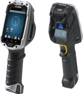
zebra-tc8000Are you a coder? Architect? Database guru? Network engineer? Mobile developer? User-experience expert? If you have hands-on tech skills, get those hands dirty at a Hackathon.

Full disclosure: Years ago, I thought Hackathons were, well, silly. If you’ve got the skills and extra energy, put them to work for coding your own mobile apps. Do a startup! Make some dough! Contribute to an open-source project! Do something productive instead of taking part in coding contests!

Since then, I’ve seen the light, because it’s clear that Hackathons are a win-win-win.

  • They are a win for techies, because they get to hone their abilities, meet people, and learn stuff.
  • They are a win for Hackathon sponsors, because they often give the latest tools, platforms and APIs a real workout.
  • They are a win for the industry, because they help advance the creation and popularization of emerging standards.

One upcoming Hackathon that I’d like to call attention to: The MEF LSO Hackathon will be at the upcoming MEF16 Global Networking Conference, in Baltimore, Nov. 7-10. The work will support Third Network service projects that are built upon key OpenLSO scenarios and OpenCS use cases for constructing Layer 2 and Layer 3 services. You can read about a previous MEF LSO Hackathon here.

Build your skills! Advance the industry! Meet interesting people! Sign up for a Hackathon!

chairAfter more than a decade of near daily use, I still love my Steelcase Think chair.

Today is cleaning day at CAHQ (Camden Associates Headquarters). That means dusting/cleaning the furniture, as well as moving piles of papers from one part of the office to another. As part of the gyrations, we flipped my trusty Steelcase Think upside down, and saw that its date of manufacture was Feb. 15, 2005. Wow. The chair is in excellent condition. The only wear is that one of the rubber armrest pads cracked and was starting to peel apart. We superglued it back together; it’s super ugly but should last for another decade.

Looking at the Steelcase site, the Think chair has changed only a little bit since mine was purchased. My chair has a black mesh back (they call it “3D knit”), black cushion seat, black frame, and black wheel base. You can still buy that combination. However, there are now new options, like different types of wheels for carpet or hard floors, a tall bar-stool-height base and even an integrated coat hanger. There are also lots more colors and materials. Oh, and the price has gone up: My particular chair configuration would cost $829 now.

What I particularly like is that there are very few settings or switches. It’s so simple, and I don’t need to keep fiddling with it.

I blogged about my chair in 2007. I recommended it then, and I still recommend it today without hesitation. Here’s what I wrote back nine years ago:

I am consistently amazed at how comfortable my Steelcase Think office chair is.

For years, my back had been sore and stiff if I sat in front of my computer for more than an hour or so. In early 2005, I mentioned that to a friend, and he said, duh, buy a better chair. I guess it was time to replace the task chair picked up second-hand 15 years earlier.

My search was exhaustive: I was willing to spend serious money to get something good. After visiting several “real” office furniture stores – places like Office Depot, Staples and Office Max have a lousy selection, imho – I fell in love with the Think.

What I like is that it’s essentially a self-adjusting chair. The Think has extremely few adjustments, and the back is made of springy steel rods. Plus the mesh fabric means that my back doesn’t get all hot and sweaty on a warm day. (You can read about the ergonomics at the Steelcase site.)

Some even pricier chairs I tested, like the Steelcase Leap and the Herman Miller Aeron, were much more complicated, and much less comfortable. With an Aeron, I literally can’t find settings that work. With the Think, it only took a minute to find the right settings, and I haven’t changed them in the past 2 ½ years.

While I can’t claim that the Think is the best premium office chair, I believe that this is the best investment that I’ve ever made in my work environment. I paid about $700 for it in 2005 at an office furniture store in San Francisco.

There are a few different versions available. Mine is the original model with mesh back, cloth seat and adjustable arms. Today, Steelcase also offers leather or vinyl coverings, fixed arms or armless, and optional headrests and lumbar supports. That makes it complicated again! When I got mine, the only option was fabric color. I chose black.

So, if you sit at your desk/computer for hours at a time, and if you’re using a cheap task chair, consider an upgrade. Try the Think — maybe it’ll work for you, maybe it won’t. (My wife tried mine out, but didn’t care for it.) The important thing is that you get a good chair that fits you well, and is comfortable. If you’re sore and stiff, duh, buy a better chair.

old-cameraIf you are asked to submit a photograph, screen shot or a logo to a publication or website, there’s the right way and the less-right way. Here are some suggestions that I wrote several years ago for BZ Media for use in lots of situations — in SD Times, for conferences, and so-on.

While they were written for the days of print publications, these are still good guidelines for websites, blog and other digital publishing media.

General Suggestions

  • Photos need to be high resolution. Bitmaps that would look great on a Web page will look dreadful in print. The recommended minimum size for a bitmap file should be two inches across by three inches high, at a resolution of 300 dpi — that is, 600×900 pixels, at the least. A smaller photograph may be usable, but frankly, it will probably not be.
  • Photos need to be in a high-color format. The best formats are high-resolution JPEG files (.jpg) and TIFF (.tif) files. Or camera RAW if you can. Avoid GIF files (.gif) because they are only 256 colors. However, in case of doubt, send the file in and hope for the best.
  • Photos should be in color. A color photograph will look better than a black-and-white photograph — but if all you have is B&W, send it in. As far as electronic files go, a 256-color image doesn’t reproduce well in print, so please use 24-bit or higher color depth. If the website wants B&W, they can convert a color image easily.
  • Don’t edit or alter the photograph. Please don’t crop it, modify it using Photoshop or anything, unless otherwise requested to do so. Just send the original image, and let the art director or photo editor handle the cropping and other post-processing.
  • Do not paste the image into a Word or PowerPoint document. Send the image as a separate file.

Logos

  • Send logos as vector-based EPS files (such as an Adobe Illustrator file with fonts converted to outlines) if possible. If a vector-based EPS file is not available, send a 300 dpi TIFF, JPEG or Photoshop EPS files (i.e., one that’s at least two inches long). Web-resolution logos are hard to resize, and often aren’t usable.

Screen Shots

  • Screen shots should be the native bitmap file or a lossless format. A native bitmapped screen capture from Windows will be a huge .BMP file. This may be converted to a compressed TIFF file, or compressed to a .ZIP file for emailing. PNG is also a good lossless format and is quite acceptable.
  • Do not convert a screen capture to JPEG or GIF.  JPEGs in particular make terrible screen shots due to the compression algorithms; solid color areas may become splotchy, and text can become fuzzy. Screen captures on other platforms should also be lossless files, typically in TIFF or PNG.

Hints for better-looking portraits

  • Strive for a professional appearance. The biggest element is a clean, uncluttered background. You may also wish to have the subject wear business casual or formal clothing, such as a shirt with a collar instead of a T-shirt. If you don’t have a photo like that, send what you have.
  • Side or front natural light is the best and most flattering. Taking pictures outdoors with overcast skies is best; a picture outdoors on a sunny day is also good, but direct overhead sunlight (near noon) is too harsh. If possible, keep away from indoor lighting, especially ceiling or fluorescent lights. Avoid unpleasant backlighting by making sure the subject isn’t standing between the camera and a window or lamp.
  • If you must use electronic flash… Reduce red-eye by asking the subject to look at the photographer, not at the camera. (Off-camera flash is better than on-camera flash.) Eliminate harsh and unpleasant shadows by ensuring that the subject isn’t standing or sitting within three feet of a wall, bookcase or other background objects. Another problem is white-out: If the camera is too close to the subject, the picture will be too bright and have too much contrast.
  • Maintain at least six feet separation between the camera and the subject, and three feet (or more) from the background. If the subject is closer than six feet to the camera, his/her facial features will be distorted, and the results will be unattractive. For best results, hold the camera more than six feet from the subject. It’s better to be farther away and use the camera’s optical zoom, rather than to shoot a close-up from a few feet away.
  • Focus on his/her eyes. If the eyes are sharp, the photo is probably okay. If the eyes aren’t sharp (but let’s say the nose or ears are), the photo looks terrible. That’s because people look at the eyes first.

I am often looking for these symbols and can’t find them. So here they are for English language Mac keyboards, in a handy blog format. They all use the Option key.

Note: The Option key is not the Command key, which is marked with ⌘ (looped square) symbol. Rather, the Option key is between Control and Command on many (most?) Mac keyboard. These key combinations won’t work a numerical keypad; you have to be using the main part of the keyboard.

The case of the letter/key pressed with the Option key matters. For example, Option+v is the root √ and Option+V (in other words, Option+Shift+v) is the diamond ◊. Another example: Option+7 is the paragraph ¶ and Option+& (that is, Option+Shift+7) is the double dagger ‡. You may simply copy/paste the symbols, if that’s more convenient.

These key combinations should work in most modern Mac applications, and be visible in most typefaces. No guarantees. Your mileage may vary.

SYMBOLS

¡ Option+1 (inverted exclamation)
¿ Option+? (inverted question)
« Option+\ (open double angle quote)
» Option+| (close double angle quote)
© Option+g (copyright)
® Option+r (registered copyright)
™ Option+2 (trademark)
¶ Option+7 (paragraph)
§ Option+6 (section)
• Option+8 (dot)
· Option+( (small dot)
◊ Option+V (diamond)
– Option+- (en-dash)
— Option+_ (em-dash)
† Option+t (dagger)
‡ Option+& (double dagger)
¢ Option+4 (cent)
£ Option+3 (pound)
¥ Option+y (yen)
€ Option+@ (euro)

ACCENTS AND SPECIAL LETTERS

ó Ó Option+e then letter (acute)
ô Ô Option+i then letter (circumflex)
ò Ò Option+` then letter (grave)
õ Õ Option+n then letter (tilde)
ö Ö Option+u then letter (umlaut)
å Å Option+a or Option+A (a-ring)
ø Ø Option+o or Option+O (o-slash)
æ Æ Option+’ or Option+” (ae ligature)
œ Œ Option+q or Option+Q (oe ligature)
fi Option+% (fi ligature)
fl Option+^ (fl ligature)
ç Ç Option+c or Option+C (circumflex)
ß Option+s (double-s)

MATH AND ENGINEERING

÷ Option+/ (division)
± Option++ (plus/minus)
° Option+* (degrees)
¬ Option+l (logical not)
≠ Option+= (not equal)
≥ Option+> (greater or equal)
≤ Option+< (less or equal)
√ Option+v (root)
∞ Option+5 (infinity)
≈ Option+x (tilde)
∆ Option+j (delta)
Σ Option+w (sigma)
Ω Option+z (ohm)
π Option+p (pi)
µ Option+m (micro)
∂ Option+d (derivative)
∫ Option+b (integral)

Let’s explore the causes of slow website loads. There are obviously some delays that are beyond our control — like the user being on a very slow mobile connection. However, for the most part, our website’s load time is entirely up to us.

For the most part, our website’s load time is entirely up to us as developers and administrators. We need to do everything possible to accelerate the experience, and in fact I would argue that load time may be the single most important aspect of your site. That’s especially true of your home page, but also of other pages, especially if there are deep links to them from search engines, other Internet sites, or your own marketing emails and tweets.

We used to say that the biggest cause of slow websites was large images, especially too-large images that are downloaded to the browser and dynamically resized. Those are real issues, even today, and you should optimize your site to push out small graphics, instead of very large images. Images are no longer the main culprit, however.

Read my recent article in the GoDaddy Garage, “Are slow website load times costing you money and pageviews?” to see the five main causes of slow website loads, and get some advice about what to do about them.

quadracopter-droneDrones are everywhere. Literally. My friend Steve, a wedding photographer, always includes drone shots. Drones are used by the military, of course, as well as spy agencies. They are used by public service agencies, like fire departments. By real estate photographers who want something better than Google Earth. By farmers checking on their fences. By security companies to augment foot patrols. And by Hollywood filmmakers, who recently won permission from the United States Federal Aviation Authority (FAA) to operate drones on a movie sets.

Drones can also be used for mischief, as reported by Nick Wingfield in the New York Times. His story, “Now, Anyone Can Buy a Drone. Heaven Help Us” described how pranksters fly drones onto sports fields to disrupt games and infuriate fans, as well as animal-welfare activists using drones to harass hunters and scare away their prey.

Drones are everywhere. My son and I were shopping at Fry’s Electronics, a popular Silicon Valley gadget superstore. Seemingly every aisle featured drones ranging in price from under US$100 to thousands of dollars.

A popular nickname for consumer-quality drones is a “quadcopter,” because many of the models feature four separate rotors. We got a laugh from one line of inexpensive drones, which was promoting quadcopters with three, four and six rotors, such as this “Microgear 2.4 GHz. Radio Controlled RC QX-839 4 Chan 6 Axis Gyro Quadcopter Drones EC10424.” I guess they never thought about labeling it a hexcopter—or would it be a sextcopter?

As drones scale up from toys to business tools, they need to be smart and connected. Higher-end drones have cameras and embedded microprocessors. Platforms like Android (think Arduino or Raspberry Pi) get the job done without much weight and without consuming too much battery power. And in fact there are products and kits available that use those platforms for drone control.

Connectivity. Today, some drones are autonomous and disconnected, but that’s not practical for many applications. Drones flying indoors could use WiFi, but in the great outdoors, real-time connectivity needs a longer reach. Small military and spy drones use dedicated radios, and in some cases, satellite links. Business drones might go that path, but could also rely upon cellular data. Strap a smartphone to a drone, and you have sensors, connectivity, microprocessor, memory and local storage, all in one handy package. And indeed, that’s being done today too. It’s a bird! It’s a plane! It’s a Samsung Galaxy S4!

Programming drones is going to be an exciting challenge, leveraging the skills needed for building conventional mobile apps to building real mobile apps. When a typical iPhone or Android app crashes, no big deal. When a drone app crashes, the best-case scenario is a broken fan blade. Worst case? Imagine the lawsuits if the drone hits somebody, causes an automobile accident, or even damages an aircraft.

Drones are evolving quickly. While they may seem like trivial toys, hobbyist gadgets or military hardware, they are likely to impact many aspects of our society and, perhaps, your business. Intrigued? Let me share two resources:

InterDrone News: A just-launched newsletter from BZ Media, publisher of SD Times. It provides a unique and timely perspective for builders, buyers and fliers of commercial unmanned aerial vehicles. Sign up for free.

InterDrone Conference & Expo: Mark your calendar for the International Drone Conference and Exposition, Oct. 13-15, 2015, in Las Vegas. If you use drones or see them in your future, that’s where you’ll want to be.

hemingwaySEYTON
The tests, my lord, have failed.

MACBETH
I should have used a promise;
There would have been an object ready made.
Tomorrow, and tomorrow, and tomorrow,
Loops o’er this petty code in endless mire,
To the last iteration of recorded time;
And all our tests have long since found
Their way to dusty death. Shout, shout, brief handle!
Thine’s but a ghoulish shadow, an empty layer
That waits in vain to play upon this stage;
And then is lost, ignored. Yours is a tale
Told by an idiot, full of orphaned logic
Signifying nothing.

Those are a few words from a delightful new book, “If Hemingway Wrote JavaScript,” by Angus Croll. For example, the nugget above is “Macbeth’s Last Callback, after a soliloquy from Macbeth from William Shakespeare.”

Literary gems and nifty algorithms abide in this code-dripping 200-page tome from No Starch Press. Croll, a member of the UI framework team at Twitter, has been writing about famous authors writing JavaScript since 2012, and now has collected and expanded the entries into a book that will be amusing to read or gift this holiday season. (He also has a serious technical blog about JavaScript, but where’s the fun in that?)

Read and wonder as you see how Dan Brown, author of “The Da Vinci Code,” would code a Fibonacci sequence generator. How Jack Kerouac would calculate factorials. How J.D. Salinger and Tupac Shakur would determine if numbers are happy or inconsolable. How Dylan Thomas would muse on refactoring. How Douglas Adams of “Hitchhiker’s Guide to the Galaxy” fame would generate prime numbers. How Walt Whitman would perform acceptance tests. How J.K. Rowling would program a routine called mumbleMore. How Edgar Allen Poe would describe a commonplace programming task:

Once upon a midnight dreary, while I struggled with JQuery,
Sighing softly, weak and weary, troubled by my daunting chore,
While I grappled with weak mapping, suddenly a function wrapping
Formed a closure, gently trapping objects that had gone before.

Twenty-five famous authors, lots of JavaScript, lots of prose and poetry. What’s not to like? Put “If Hemingway Wrote JavaScript” on your shopping list.

Let’s move from JavaScript to C, or specifically the 7th Underhanded C Contest. If you are a brilliantly bad C programmer, you might win a US$200 gift certificate to popular online store ThinkGeek. The organizer, Prof. Scott Craver of Binghamton University in New York, explains:

The goal of the contest is to write code that is as readable, clear, innocent and straightforward as possible, and yet it must fail to perform at its apparent function. To be more specific, it should do something subtly evil. Every year, we will propose a challenge to coders to solve a simple data processing problem, but with covert malicious behavior. Examples include miscounting votes, shaving money from financial transactions, or leaking information to an eavesdropper. The main goal, however, is to write source code that easily passes visual inspection by other programmers.

The specific challenge for 2014 is to write a surveillance subroutine that looks proper but leaks data. The deadline is Jan. 1, 2015, more or less. See the Underhanded C website; be sure to read the FAQ!

satya-nadellaI like this new Microsoft. Satya Nadella’s Microsoft. Yes, the CEO needs to improve his public speaking skills, at least when talking to women’s conferences. Yet when you look at the company’s recent activities, what appears are lots of significant moves toward openness, a very positive focus on personal productivity, and even inventiveness.

That’s not to say that Microsoft is firing on all cylinders. There is too much focus on Windows as the universal platform, when not every problem needs Windows as a solution. There is too much of a focus on having its own mobile platform, where Windows Phone is spinning its wheels and can’t get traction against platforms that are, quite frankly, better. Innovation is lacking in many of Microsoft’s older enterprise products, from Windows Server to Exchange to Dynamics. And Microsoft isn’t doing itself any favors by pushing Surface Pro and competing against its loyal OEM partners—thereby undermining the foundations of its success.

That said, I like some of Microsoft’s most recent initiatives. While it’s possible that some of them were conceived under former CEO Steve Ballmer, they are helping demonstrate that Microsoft is back in the game.

Some examples of success so far:

  • Microsoft Band. Nobody saw this low-cost, high-functionality fitness band coming, and it took the wind out of the Apple Watch and Samsung Gear. The Band is attractive, functional, and most importantly, cross-platform. Of course, it works best at present with Windows Phone, but it does work with Android and iOS. That’s unexpected, and given the positive reviews of Band, I’m very impressed. It makes me think: If Zune had been equally open, would it have had a chance? (Umm. Probably not.)
  • Office Mobile. The company dropped the price of its Office suite for iPhone, Android, Windows Phone and iPad to the best possible price: free. Unlike in the past, the mobile apps aren’t crippled unless you tie them to an Office 365 license for your Windows desktop. You can view, edit and print Word, Excel and PowerPoint documents; use OneNote; and even use the Lync communications platform. Whether Microsoft realized that mobile users are a different breed, or whether it saw the opportunity to use mobile as a loss leader, it’s hard to say. This change is welcome, however, and has added to Microsoft’s karma credit.
  • Microsoft Sway. Another “didn’t see it coming” launch, Sway is a new presentation program that will be part of the Office suite. It’s not PowerPoint; it’s geared toward online presentations, not slide shows. The company writes: “Sway’s built-in design engine takes the hassle out of formatting your content by putting all of it into a cohesive layout as you create. This means that from the first word, image, Tweet, or graphic you add, your Sway is already being formed for you. This is thanks to a lot of Microsoft Research technology we’ve brought together in the background. As you add more of your content, Sway continues to analyze and arrange it based on the algorithms and design styles we’ve incorporated.” That’s not PowerPoint—and it’s perfect for today’s Web and mobility viewing.
  • .NET Core is open source. Nadella said that Microsoft was committed, and the release of the .NET Core to GitHub is a big deal. Why did the company do this? Two reasons according to Immo Landwerth: “Lay the foundation for a cross-platform .NET. Build and leverage a stronger ecosystem.” Cross-platform .NET? That would indeed by welcome news, because after all, there should be nothing Windows-specific about the .NET sandbox. Well, nothing technical. Marketing-wise, it was all about customer lock-in to Windows.
  • Microsoft is removing the lock-in—or at least, some of the lock-in. That’s good for customers, of course, but could be scary for Microsoft—unless it ensures that if customers have a true choice of platforms, they intentionally choose Windows. For that to be the case, the company will have to step up its game. That is, no more Windows 8-style fiascos.

Microsoft is truly on the right track, after quite a few years of virtual stagnation and playing catch-up. It’s good that they’re back in the game and getting stuff done.

Graeme WarringThirty seconds. That’s about how long a mobile user will spend with your game before deciding if he or she will continue using it. Thirty seconds. Maybe a minute. If you haven’t engaged the customer by then, forget it.

That’s according to Graeme Warring, COO of 2XL Games LLC, a game startup based in Phoenix. Speaking at an investor conference here today sponsored by AZ TechBeat, Warring explained that while mobile games are exploding, it’s getting harder and harder to make money at it.

One culprit that’s especially true with mobile games is that the new business model is free-to-play. That is, gamers can download the mobile app at no cost. They have, therefore, little or no emotional investment. They might try the game. They might not try it. They might play for 30 seconds or a minute. There’s no sense of guilt to drive them to engage with the software for hours or days, and then be inspired to use in-app payments to improve the gaming experience.

By contrast, consider a console game, such as for Sony’s PlayStation 4 or Microsoft’s Xbox One. A typical game might cost US$60. The gamer has done his/her research before making that purchase. Thanks to the emotional and financial investment, he/she is going to make a serious effort to play that game.

“It’s problem transference,” explained Warring. Who owns the problem of ensuring that the player gives the game a serious try? For an expensive console game, it’s the player’s problem. For a free-to-play mobile game, it’s your problem as the game developer.

Getting the player to engage requires an outstanding initial experience. Don’t require a steep learning curve; the era of preliminary in-game tutorials is long gone. Get the player involved instantly, and make it a fun and rewarding experience. Later, and only later, should you try to monetize through in-app purchases. Whether it’s a new weapon for a shoot-em-up, or grippier tires for a racing game, or more lives and candy and prizes, those become appealing only after the player is hooked and engaged.

Warring and other speakers at the AZ TechBeat conference made the point that the best-selling, top-revenue-producing games come from a small number of firms. They insist, however, that there are tremendous opportunities to make a smaller game, perhaps one that costs less than $5 million to create and market, and to make a profit from the investment.

Marketing is key. Expect to spend as much on marketing as on development, “and be prepared to burn through that budget,” the speakers insisted. That may mean social media; it may mean licensing arrangements. To that end, they suggest that instead of creating your own new brand and attracting a new audience, you may do better licensing an existing brand and a proven audience. Making a motorcycle racing game? License and tie it in with an existing motorcycle event, if you can. Such a tie in might be expensive, but it might bootstrap downloads and maybe even help attract investors.

That, in turn, will buy you 30 seconds. Make the most of it.

apple_watchFirst Impressions of the Apple Watch: Surprised that it’s not called the iWatch. The user interface looks surprisingly cool. Distressed that the Apple Watch needs to be charged every day, but if the docking station is sufficiently easy to use, it shouldn’t be a deal breaker.

The watches look like real watches, beautiful as well as functional. The pricing of US$349 and up doesn’t scare me. The long delay for the release—not until early 2015—gives competitors like Motorola and Samsung a great opportunity to respond and seize the initiative. I hope that by the release date, Apple Watch will work with Android phones (and maybe Windows Phone), not only iPhones.

First Impressions of Pay-to-Yelp: The Ninth Circuit Court of Appeals in San Francisco ruled that Yelp did not extort businesses by changing how business reviews appeared on its site based on their advertising status. For example, because Yelp never had any agreement to be impartial in its dealings with Dr. Tracy Chan (a dentist who never bought ads from the company), the judge said:

We begin with Chan, who alleges that Yelp extorted her by removing positive reviews from her Yelp page. Chan asserts that she was deprived of the benefit of the positive reviews Yelp users posted to Yelp’s website, and that, had she received the benefits of the positive reviews, they would have counteracted the negative reviews other users posted. But Chan had no pre-existing right to have positive reviews appear on Yelp’s website. She alleges no contractual right pursuant to which Yelp must publish positive reviews, nor does any law require Yelp to publish them. By withholding the benefit of these positive reviews, Yelp is withholding a benefit that Yelp makes possible and maintains. It has no obligation to do so, however.

This sets a scary precedent that could affect all for-profit businesses that both provide a forum for user feedback and which benefit in some way from that feedback. For example, an electronics reseller will undoubtedly sell more products if the reviews of those products are positive. There is nothing to stop such a reseller from removing negative reviews of products that it wants to sell (such as those that have profit margins or where the manufacturer offers incentives), or removing positive reviews from other products. While I never had much faith in online reviews, whether of books, hotels or big-screen TVs, I will have even less faith in them now.

First Impressions of COBOL: Well, okay, it’s not a first impression, but let us revisit last week’s column, where I talked about job opportunities for young COBOL developers. Kevin Nitert, a 26-year-old developer from the Netherlands, responded, “While it’s very true [COBOL] is easy to learn, the problem is that most companies work directly on the mainframe or ISPF. So learning COBOL is only one part; you have to know about the mainframe environment as well and learn things about JCL and REXX.”

I totally agree and should have talked about the environment. It is easy to learn COBOL on your own or with online training. Picking up the mainframe and environment is much harder. It’s been my experience that employers bringing in employees to work on legacy systems expect to do such training themselves, especially if those employees are young and were hired for their aptitude, not for their specific legacy skills with the platform.

To be honest, it wouldn’t take long to bring newbies up to speed on REXX (Restructured Extended Executor, a sophisticated scripting and job-control language) and ISPF (Interactive System Productivity Facility, a development tool chain for IBM’s z-series mainframes).

OTN-Tour-2014-370x395If your developers aren’t enrolled in developer relations programs, they will grow old and stale. They will become moldy. They will pine for the Good Old Days and opine endlessly about the irrelevance of new tools, new platforms, new paradigms and new ideas. No matter their brilliance today, they will become obsolescent.
You can’t let that happen!

Developer relations programs are all over the map, literally. Some are focused on operating systems – see those from Apple and Microsoft. Some are about back-end platforms, like programs from IBM or Oracle. Some are tied to very specific products.

It’s hard to know where your developers will get the best value. Let’s take a very simplistic case. If you have a bright programmer who is working to integrate back-end Oracle databases with Windows servers, should she be a member of the Oracle Technology Networkor MSDN? Likely both; it doesn’t hurt to sign up. But where should she spend her time?

It’s tricky to make that call, and it largely depends on both the developers’ self-starter motivation and your own corporate culture. Some developer programs are free, but others aren’t, with prices ranging from a hundred dollars per year to thousands of dollars. Do you offer to cover the costs of belonging to the developer program for each architect, designer, coder or tester who wants to sign up – or do they have to go through hoops that send out the message that the programs aren’t important (or that the employee isn’t worth the investment)?

Let’s say that you are running a Windows shop, and being a Windows Server guru is seen as essential for career growth. Clearly, your bright programmer should grow and enhance her skills as a Windows expert. While deep Oracle expertise is essential, it might be a secondary investment for her time.

Of course, if your team is seen as an Oracle shop, and the Microsoft aspect is seen as secondary, she should invest her time in Oracle technologies.

The scenario above is too simple. There’s no reason that the bright programmer can’t participate in two developer programs. However, what’s a reasonable ceiling. Two? Three? Five? Ten? If developers spread themselves out too thin, it’s hard to gain deep expertise. To my mind, a developer should engage with 3-5 development programs; probably no more. Depending on the situation, though, perhaps only one or two would be appropriate. If you have a developer who doesn’t see any benefit in belonging to a developer relations program, look at where he or she is spending time. There may be local user groups that provide the same level of engagement. But if you have someone who doesn’t want to engage at all in the larger world beyond his or her team — who doesn’t see the value of building deep expertise in products or platforms — you should be concerned.

Early in 2014, the market research firm Evans Data Corp. conducted a study on developer relations programs. They asked developers, “What most motivates you to seek solutions from developer programs?” The answers should not surprise anyone:

  • 35.5%: Need to upgrade from existing, outdated technology
  • 24.3%: Present skillset is insufficient
  • 21.7%: Present toolsets are insufficient
  • 8.5%: Anticipating future problems
  • 6.3%: Need to match or beat competition
  • 3.8%: Other

I’d keep an eye on those who answered “present skillset is insufficient.” Those employees are investing in themselves — and they are going places!

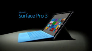
Surface-Pro-3With the May 20 introduction of the Surface Pro 3, Microsoft has unofficially withdrawn from the tablet market. If you’re looking for a tablet computer, your two main platform choices are now Android and iOS.
The Surface Pro 3 isn not an Apple iPad competitor. It doesn’t go up against the Google Nexus family, or the broad Samsung Galaxy product range. Nope.

With the Surface Pro 3, Microsoft has quietly redefined the Surface product line as consisting of ultralight Windows notebooks with touch-screens and removable keyboards. That’s a “tablet” in the sense of the circa-2005 Windows tablets that ran Microsoft Windows XP Tablet PC Edition. I still have a Fujitsu Lifebook T4010 from that generation, and it was an excellent notebook, with flip-around screen and stylus. Better than a conventional notebook, yes. A device like an iPad or Nexus or Galaxy? Nope.

Yet the Surface Pro family is not inexpensive. It’s priced like high-powered, lightweight notebooks like Apple’s MacBook Air. In some configurations, it’s even pricier. As Microsoft writes in its specifications: “Surface Pro 3 has a 12-inch ClearType Full HD display, fourth-generation Intel Core processor, and up to 8GB of RAM. With up to nine hours of Web-browsing battery life, Surface Pro 3 has all the power, performance and mobility of a laptop in an incredibly lightweight, versatile form.”

Doesn’t sounds like a Galaxy, Nexus or iPad killer. Of course, the Surface can be a tablet sometimes, and that’s Microsoft’s thinking: Most of the time, you want a notebook. Sometimes you want a tablet. Why have two machines?

The complexity of Windows 8.0 (shipped with the original Surface Pro) and the newer Windows 8.1 made the Surface a questionable replacement for a standard tablet. For a short period of time, yes, you can unclick the keyboard and have a walk-around tablet for surfing the Web, watching a movie, reading a book, playing a game or filling in forms.

No comparison to what most of us call tablets: “Surface Pro 3 is a tablet and a laptop: multiple processors, RAM and storage options intersect with a sleek design that, with a simple snap or click, transform the device from a perfectly balanced tablet to a full-functioning laptop and back again— all in a beautiful package that is 30 percent thinner than an 1-inch MacBook Air,” says Microsoft.

The Surface Pro 3 is like an upgraded Fujitsu Lifebook from 2005. Another quote from Microsoft’s announcement:

“So many people carry both a laptop and a tablet but really want just one device that serves all purposes,” said Panos Panay, corporate vice president for Microsoft Surface. “Surface Pro 3 is the tablet that can replace your laptop—packing all the performance of a fully powered laptop into a thin, light and beautifully designed device. You’ll love being able to carry a single device for your next class, workday or weekend getaway knowing you have all the power you need.”

Also, the bevy of configurations—see Microsoft’s pricing sheet—makes this more like a notebook purchase than a tablet. Four storage configurations from 64GB to 512GB. Intel i3, i5 and i7 processors. 4GB or 8GB RAM. USB ports, microSD card reader, Mini DisplayPort, for external monitor: It’s a notebook. Except, of course, that you have to buy the keyboard separately. Bad move, Microsoft.

I am a genuine fan of the Surface Pro. I own the original 2013 model and use it as my main Windows portable. Yeah, it’s a bit slow, and the battery life is terrible, but it’s an excellent notebook. The new Surface Pro 3 is superior. Were I shopping for a new Windows machine, I’d run down to the Microsoft store and buy one.

But it’s not a tablet. There’s no small form-factor version of the Surface Pro 3. There is no upgrade of the truly tablet-class non-pro Surface running Windows RT, which you can pick up for US$299.

Bottom line: Microsoft makes great hardware, and has pulled out of the tablet market.

LAS VEGAS — If you are a geek, there are few events geekier than the huge Consumer Electronics Show, held here each January. Here is where you’ll find the latest toys, toys, toys, toys, toys and toys. Such as smart glasses, smart cars, shape-recognizing SDKs, robots with intelligent programmable faces, and so much more.

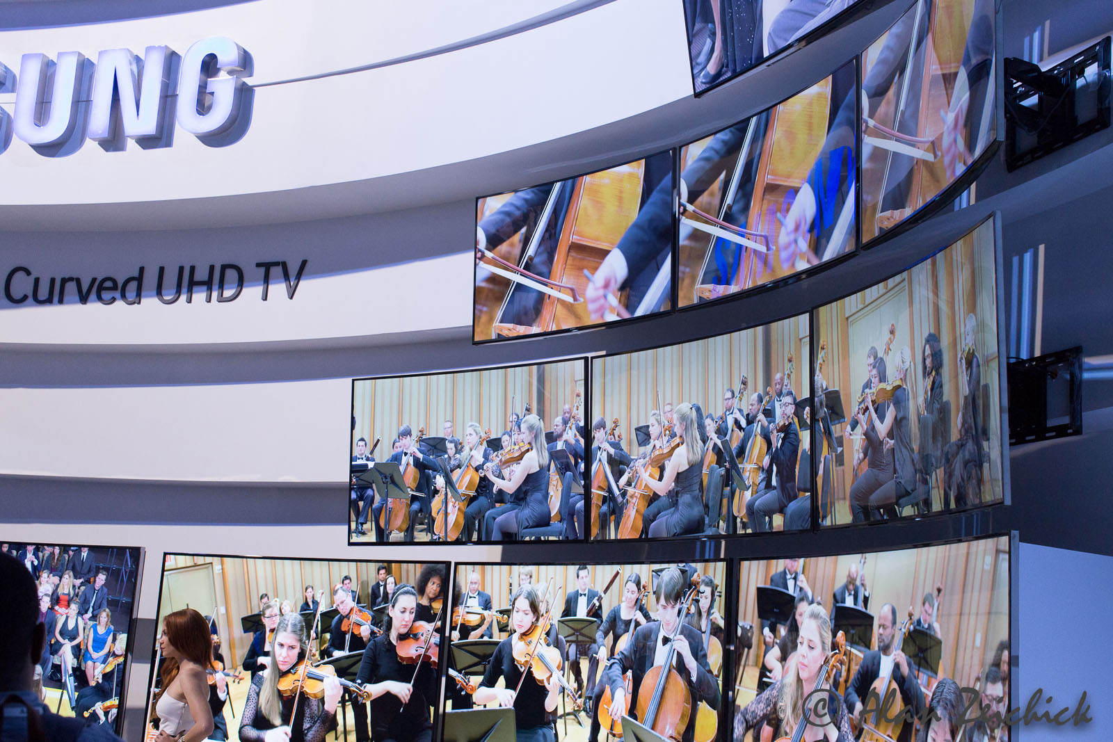
Most of the 150,000+ people who attended CES were mesmerized by the show-stopping curved UHD (ultra high definition) televisions that are at either 4K (2160p) or 8K (4320p) resolution. The 105-inch model from LG blows my home 60-inch Samsung 1080p television out of the water, and yes, I’ll buy one in a few years.

Samsung UHD TVs
Curved ultra high definition televisions, like these 4K models from Samsung, stole the show at the 2014 Consumer Electronics Show.

Beyond TVs, there are lots of 3D printers from startups likeMakerBot, feature-packed cameras from giants like Canon, self-driving cars from BMW, wearables like the LG Lifeband, and phone cases. Hundreds of booths with phone cases. It’s amazing how many phone case manufacturers and distributors are here in Las Vegas.

(Who the heck needs all those phone cases? The mind boggles.)

One thing I learned at CES—though I’m sure it’s common knowledge in the robotics community—is that it’s easier to build a robot that has a large LCD screen with an animated face instead of constructing a real humanoid robotic face. The cartoon face is more expressive and less intimidating than a realistic simulacrum. Plus, software is a lot less expensive to create and update than animatronic bones, skin, motors and servos.

Beyond TVs, cameras and phone cases, here are two introductions from smaller companies that caught my eye at CES as being very interesting for software developers:
#!• The new M100 smart glasses from Vuzix are similar to Google Glass, only you can buy it today, it’s less expensive than Google Glass (US$999), it’s a full Android implementation, and you don’t have to jump through Google’s restrictive hoops to build apps. If you are willing to forego the snob value of genuine Google Glass, and don’t need quite the high-end hardware, you can have an Ice Cream Sandwich head-mount display with 24-bit color, a 400×240 display, 1GB of RAM, 4GB of storage, a MicroSD slot, a speaker, a noise-cancelling microphone, a 5MP camera, 1080p video, a six-hour battery, WiFi and Bluetooth. Most recently, Vuzix announced that a software update will add voice recognition based on Nuance speech technology. Yes, you won’t get Google Glass’ 640×360 display, but did I mention the M100 is available now?

Vuzix M100 smart glasses
It’s here now, it’s less expensive than Google Glass, and its Android stack is wide open to developers: the M100 Smart Glasses from Vuzix. The kit includes the glasses, and you can wear it on either the left or right side.

The Asus Transformer Book Duet is a head-scratcher. It’s an Intel-based laptop that looks like an Apple MacBook Air, but runs both Windows 8.1 and Android 4.2.2. The review from Ars Technica says it best: It’s clunky. Let’s assume that it gets less clunky. What would you (or your customers or employees) do with a single device that combines the best of Windows and the best of Android? I’m not sure, but if Intel’s “Dual OS” concept catches on, there could be interesting developer opportunities.

By the way, my favorite tech event that’s even geekier than CES is ACM SIGGRAPH. Catch it in Vancouver this August. Gosh, I hope there aren’t any phone cases there.

Dr. Douglas Engelbart, who passed away on July 2, was best known as the inventor of the computer mouse. While Dr. Engelbart was the brains behind many revolutionary ideas, his demonstration of a word processor using a mouse in 1968 paved the way for the graphical user interfaces in Xerox’s Alto (1973), Apple’s Lisa (1979) and Macintosh (1984), Microsoft’s Windows (1985) and IBM’s OS/2 Presentation Manager (1988).

Future generations may regard the mouse as a transitional technology. Certainly the touch interface, popularized in the iPad, Android tablets and Windows 8, are making a dent in the need for the mouse — though my Microsoft Surface Pro is far easier to use with a mouse, in addition to the touch screen.

Voice recognition is also making powerful strides. When voice is combined with a touch screen, it’s possible to envision the post-WIMP (Windows, Icons, Menus and Pointing Devices) mobile-style user experience surpassing mouse-driven systems.

Dr. Engelbart, who was recently fêted in Silicon Valley, was 88. Here are some links to help us gain more insight into his vision:

Obituary in the New York Times, by John Markoff.

“The Mother of All Demos” on 1968. Specifically, see clips 3 and 12 where Dr. Engelbart edits documents with a mouse.

A thoughtful essay about Dr. Engelbart’s career, by Tom Foremski.

I never had the honor of meeting Dr. Engelbart. There was a special event commemorating his accomplishments at Stanford Research Institute in 2008, but unfortunately I was traveling.

It’s remarkable for one person to change the world in such a significant way – and so fast. Dr. Engelbart and his team invented not only the mouse, but also personal computing as we know it today. It is striking how that 1968 demo resembles desktop and notebook computing circa 2013. Not bad. Not bad at all. May his memory be a blessing.

Web sites developed for desktop browsers look, quite frankly, terrible on a mobile device. The look and feel is often wrong, very wrong. Text is the wrong size. Gratuitous clip art on the home page chews up bandwidth. Features like animations won’t behave as expected. Don’t get me started on menus — or on the use-cases for how a mobile user would want to use and navigate the site.

Too often, some higher-up says, “Golly, we must make our website more friendly,” and what that results in is a half-thought-out patch job. Not good. Not the right information, not the right workflow, not the right anything.

One organization, UserTesting.com, says that there are four big pitfalls that developers (and designers) encounter when creating mobile versions of their websites. The company, which focuses on usability testing, says that the biggest issues are:

Trap #1 – Clinging to Legacy: ‘Porting’ a Computer App or Website to Mobile
Trap #2 – Creating Fear: Feeding Mobile Anxiety
Trap #3 – Creating Confusion: Cryptic Interfaces and Crooked Success Paths
Trap #4 – Creating Boredom: Failure to Quickly Engage the User

Makes sense, right? UserTesting.com offers a quite detailed report, “The Four Mobile Traps,” that goes into more detail.

The report says,

Companies creating mobile apps and websites often underestimate how different the mobile world is. They assume incorrectly that they can create for mobile using the same design and business practices they learned in the computing world. As a result, they frequently struggle to succeed in mobile.

These companies can waste large amounts of time and money as they try to understand why their mobile apps and websites don’t meet expectations. What’s worse, their awkward transition to mobile leaves them vulnerable to upstart competitors who design first for mobile and don’t have the same computing baggage holding them back. From giants like Facebook to the smallest web startup, companies are learning that the transition to mobile isn’t just difficult, it’s also risky.

Look at your website. Is it mobile friendly? I mean, truly designed for the needs, devices, software and connectivity of your mobile users?

If not — do something about it.

Everything, it seems, is a game. When I use the Waze navigation app on my smartphone, I earn status for reporting red-light cameras. What’s next: If I check in code early to version-control system, do I win a prize? Get points? Become a Code Warrior Level IV?

Turning software development into a game is certainly not entirely new. Some people live for “winning,” and like getting points – or status – by committing code to open-source projects or by reporting bugs as a beta tester. For the most part, however, that was minor. The main reason to commit the code or document the defect was to make the product better. Gaining status should be a secondary consideration – a reward, if you will, not a motivator.

For some enterprise workers, however, gamification of the job can be more than a perk or added bonus. It may be the primary motivator for a generation reared on computer games. Yes, you’ll get paid if you get your job done (and fired if you don’t). But you’ll work harder if you are encouraged to compete against other colleagues, against other teams, against your own previous high score.

Would gamification work with, say, me? I don’t think so. But from what I gather, it’s truly a generational divide. I’m a Baby Boomer; when I was a programmer, Back in the Day, I put in my hours for a paycheck and promotions. What I cared about most: What my boss thought about my work.

For Generation Y / Millennials (in the U.S, generally considered to be those born between 1982 and 2000), it’s a different game.

Here are some resources that I’ve found about gamification in the software development profession. What do you think about them? Do you use gamification techniques in your organization to motivate your workers?

Gamification in Software Development and Agile

Gamifying Software Engineering and Maintenance

Gamifying software still in its infancy, but useful for some

Some Thoughts on Gamification and Software

TED Talk: Gaming can make a better world 

The subject line in today’s email from United Airlines was friendly. “Alan, it’s been a while since your last trip from Austin.”

Friendly, yes. Effective? Not at all close.

Alan, you see, lives in northern California, not in central Texas. Alan rarely goes to Austin. Alan has never originated a round trip from Austin.

My most recent trip to Austin was from SFO to AUS on Feb. 13, 2011, returning on Feb. 15, 2011. The trip before that? In 2007.

Technically United is correct. It indeed has been a while since my last trip from Austin. Who cares? Why in the world would United News & Deals — the “from” name on that marketing email— think that I would be looking for discounted round-trip flights from Austin?

It is Big Data gone bad.

We see example of this all the time. A friend loves to post snarky screen shots of totally off-base Facebook ads, like the one that offered him ways to “meet big and beautiful women now,” or non-stop ads for luxury vehicles. For some reason, Lexus finds his demographic irresistible. However: My friend and his wife live in Manhattan. They don’t own or want a car.

Behavioral ad targeting relies upon Big Data techniques. Clearly, those techniques are not always effective, as the dating, car-sales and air travel messages demonstrate. There is both art and science to Big Data – gathering the vast quantities of data, processing it quickly and intelligently, and of course, using the information effectively to drive a business purpose like behavioral marketing.

Sometimes it works. Oops, sometimes it doesn’t. Being accurate isn’t the same as being useful.

Where to learn that art and science? Let me suggest Big Data TechCon. Three days, dozens of practical how-to classes that will teach you and your team how to get Big Data right. No, it’s not in Austin— it’s near Boston, from April 8-10, 2013. Hope to see you there— especially if you work for United Airlines or Lexus.