Photo and artwork guidelines for people, products, logos and screen shots
 If you are asked to submit a photograph, screen shot or a logo to a publication or website, there’s the right way and the less-right way. Here are some suggestions that I wrote several years ago for BZ Media for use in lots of situations — in SD Times, for conferences, and so-on.
While they were written for the days of print publications, these are still good guidelines for websites, blog and other digital publishing media.
General Suggestions
- Photos need to be high resolution. Bitmaps that would look great on a Web page will look dreadful in print. The recommended minimum size for a bitmap file should be two inches across by three inches high, at a resolution of 300 dpi — that is, 600×900 pixels, at the least. A smaller photograph may be usable, but frankly, it will probably not be.
- Photos need to be in a high-color format. The best formats are high-resolution JPEG files (.jpg) and TIFF (.tif) files. Or camera RAW if you can. Avoid GIF files (.gif) because they are only 256 colors. However, in case of doubt, send the file in and hope for the best.
- Photos should be in color. A color photograph will look better than a black-and-white photograph — but if all you have is B&W, send it in. As far as electronic files go, a 256-color image doesn’t reproduce well in print, so please use 24-bit or higher color depth. If the website wants B&W, they can convert a color image easily.
- Don’t edit or alter the photograph. Please don’t crop it, modify it using Photoshop or anything, unless otherwise requested to do so. Just send the original image, and let the art director or photo editor handle the cropping and other post-processing.
- Do not paste the image into a Word or PowerPoint document. Send the image as a separate file.
Logos
- Send logos as vector-based EPS files (such as an Adobe Illustrator file with fonts converted to outlines) if possible. If a vector-based EPS file is not available, send a 300 dpi TIFF, JPEG or Photoshop EPS files (i.e., one that’s at least two inches long). Web-resolution logos are hard to resize, and often aren’t usable.
Screen Shots
- Screen shots should be the native bitmap file or a lossless format. A native bitmapped screen capture from Windows will be a huge .BMP file. This may be converted to a compressed TIFF file, or compressed to a .ZIP file for emailing. PNG is also a good lossless format and is quite acceptable.
- Do not convert a screen capture to JPEG or GIF. JPEGs in particular make terrible screen shots due to the compression algorithms; solid color areas may become splotchy, and text can become fuzzy. Screen captures on other platforms should also be lossless files, typically in TIFF or PNG.
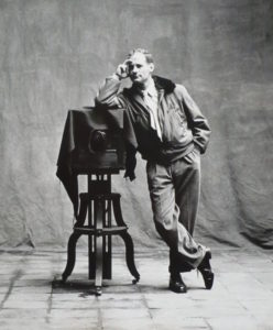
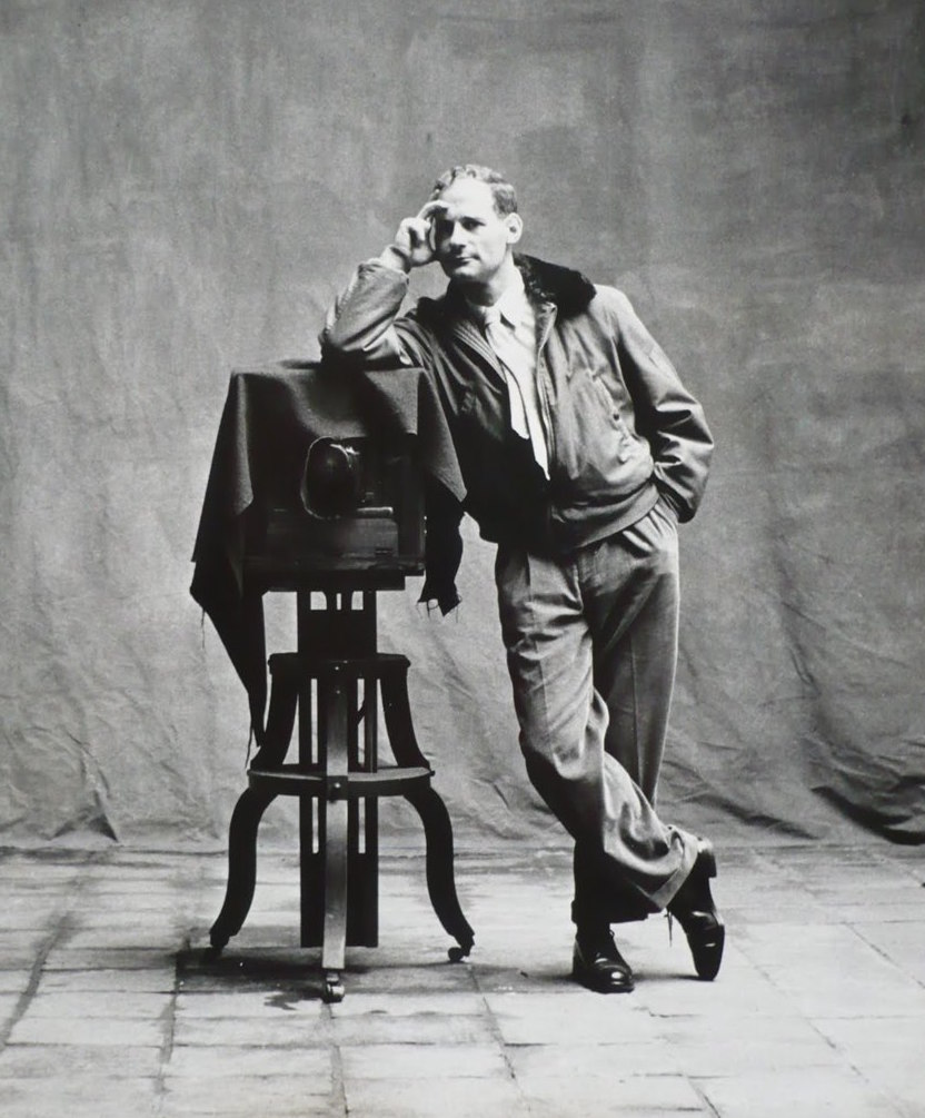
Hints for better-looking portraits
- Strive for a professional appearance. The biggest element is a clean, uncluttered background. You may also wish to have the subject wear business casual or formal clothing, such as a shirt with a collar instead of a T-shirt. If you don’t have a photo like that, send what you have.
- Side or front natural light is the best and most flattering. Taking pictures outdoors with overcast skies is best; a picture outdoors on a sunny day is also good, but direct overhead sunlight (near noon) is too harsh. If possible, keep away from indoor lighting, especially ceiling or fluorescent lights. Avoid unpleasant backlighting by making sure the subject isn’t standing between the camera and a window or lamp.
- If you must use electronic flash… Reduce red-eye by asking the subject to look at the photographer, not at the camera. (Off-camera flash is better than on-camera flash.) Eliminate harsh and unpleasant shadows by ensuring that the subject isn’t standing or sitting within three feet of a wall, bookcase or other background objects. Another problem is white-out: If the camera is too close to the subject, the picture will be too bright and have too much contrast.
- Maintain at least six feet separation between the camera and the subject, and three feet (or more) from the background. If the subject is closer than six feet to the camera, his/her facial features will be distorted, and the results will be unattractive. For best results, hold the camera more than six feet from the subject. It’s better to be farther away and use the camera’s optical zoom, rather than to shoot a close-up from a few feet away.
- Focus on his/her eyes. If the eyes are sharp, the photo is probably okay. If the eyes aren’t sharp (but let’s say the nose or ears are), the photo looks terrible. That’s because people look at the eyes first.

