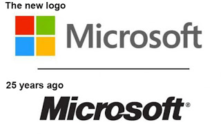
The new Microsoft logo
The temptation to write about Microsoft’s brand-new logo is almost unbearable. I’ve been trying to resist but… okay. I can’t resist any longer.
Microsoft has a new logo. It has color squares reminiscent of the four color blocks in Office, SharePoint, Visual Studio, and so-on, with the word “Microsoft” spelled out in type. The Pac-Man-like bite out of the letter “o” is gone.
You can see the new logo in this blog post from Jeff Hansen, General Manager, Brand Strategy, Microsoft. Hansen writes
The Microsoft brand is about much more than logos or product names. We are lucky to play a role in the lives of more than a billion people every day. The ways people experience our products are our most important “brand impressions”. That’s why the new Microsoft logo takes its inspiration from our product design principles while drawing upon the heritage of our brand values, fonts and colors.
Ahhh. When I see companies redrawing their logos, I’m reminded of ship stewards rearranging the deck chairs. Don’t they have something better to spend their time on, their money on, than redrawing a well-recognized, 25-year-old logo? Think about the signs that must be remade, documents that must be reprinted, business cards, brand identity handbooks, and so-on. The ROI for this is what?
The same was true, by the way, for the last several movies based on the Star Trek: The Next Generation crew. Why was the Federation constantly redesigning its Star Fleet uniforms? But I digress.
Let’s not forget the 2010 logo redesign for the Gap, a chain of clothing stores. The social-media outrage about this logo change was so swift that the Gap reversed itself a week later. Amazing. You can read the whole sordid story here in Vanity Fair.
The new Microsoft logo isn’t terrible. But it’s not wonderful either. Yes, the colors tie the corporate logo to flagship product identities, but other tech companies like Google use similar colors with Chrome and other product lines. The new Microsoft logo seems utterly unnecessary – and the timing isn’t great.


