In the iPad 3 era, pay attention to the Pixels-Per-Inch
I love, love, love my Dell 3007WFP monitor. The 30” beast – showing 2560 x 1600 pixels – has been on my desk since January 2007, when I bought it (refurbished) from the Dell Outlet Store for $1,162.60.
Clearly, I’ve gotten my money’s worth out of this display, which has been variously connected to Windows desktops, Sun workstations, and now to a MacBook Air via a “Mini DisplayPort To Dual-Link DVI Adapter.”
The screen looks good, but to be honest, it’s not fantastic. One reason is that the pixel density of the Dell screen is usual for most desktop and notebook computers, at about 100 pixels per inch diagonally. (You get there by calculating the number of pixels on the diagonal, which is 3018, and dividing by the diagonal screen size, which is 30 inches.)
The internal display on the MacBook Air is visibly sharper, and not only because it’s newer. The main reason is because it has a higher pixel density. The screen is 1440 x 900 pixels on a 13-inch diagonal, for a PPI of 131. Thus, a graphic image of a certain size (say, 400 x 400 pixels) appears about 30% smaller on the laptop’s screen – and therefore, it’s sharper and crisper. The same is true with text as well. The higher the PPI, the sharper the graphics.
By comparison, the original iPad and then the iPad 2 had screens with essentially the same PPI as the MacBook Air’s 13” monitor. The tablets’ 9.7-inch screen has a resolution of 1024 x 768 pixels, which computes to a PPI of 132.
Most mainstream notebook and desktop displays are 100 PPI; a few, obviously go up higher. Variation is within a fairly narrow range — and so Web designers could basically ignore the issue and focus on the physical count of the pixels.
If your app server sniffed that the browser was, say, 1024 x 768, you knew that the end user had a small screen, and you might cut back how much you displayed. If you saw that the user had, say, 2048 x 1536, you could assume that the end user had a big 24-inch or 27-inch desktop monitor and you could show lots of information.
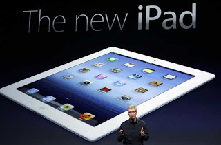
No more. We are entering a whole new world of high-PPI displays, which first appeared on the iPhone 4, but now are on the new iPad (which I’m going to call iPad 3, even though that’s not its official name).
The iPad 3’s display is 2048 x 1536, which computes out to a PPI of 263.9. That’s significantly larger. A 400×400 pixel graphic on my Dell external monitor will be four inches high. On the MacBook Air or on an iPad 2, it will be 3.1 inches high. On an iPad 3, a 400 x 400 graphic will be 1.5 inches high.
Or, to put it another way, if you have a Web graphic that uses a color band that’s 30 pixels high, it will be .30 inches high on a standard monitor, .23 inches on an iPad 2 or MacBook Air, and .11 inches on the iPad 3.
Say that color band contains 20-pixel-high white text. That text is a readable .20 inches on a standard monitor, but only . 07 inches high on the iPad 3. Unless the user zooms to scale it up, forget about reading it.
On a native app running on an iPad 3, of course, the operating system will take care of dynamically scaling text or graphics, or will substitute larger graphics provided by the developer. No problem. But what about Web pages? You can’t simply sniff out a 2048 x 1536 screen and assume you’re working with a large desktop screen. Not any more.
For now, the workaround is easy: If you can detect that it’s an iPad 3, you can adapt your Web page accordingly. You just need to remember to do that. And of course, pick up an iPad 3 for testing.
What about tomorrow? High-PPI displays will spread. Other tablets will have them soon. Notebooks will adopt them. Desktops. How long before Apple releases a 27-inch iMac display that’s 263 PPI? Dell – HP – Lenovo – Samsung. We are in a new era of small-pixel devices. We can’t assume anything any more.
Z Trek Copyright (c) Alan Zeichick