Skeuomorph: Fake leather textures on your mobile apps – good or bad?
Skeuomorph. I learned this word a few weeks ago, after a flurry of stories broke on various mass-media websites about an apparent kerfuffle within Apple about user interface design.
A skeuomorph is a design element that looks functional, but is actually purely ornamental. The automotive world is rife with skeuomorphs. Fake hood scoops on sports cars, plastic tire covers that imitate wire wheels, plastic that’s textured and painted to look like wood.
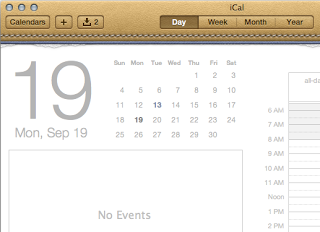
Check out the Wikipedia page and you’ll see several examples, including the program that sparked a number of articles. That’s Apple’s iCal calendaring application on the company’s iPhone and iPad devices, or Calendar on a Mac.
Look at the calener on an iPad. See how the app is designed to resemble an old printed calendar, and the top of the app looks like embossed leather, complete with stitching? See how there’s even a little graphic detail that make it look like pages have been torn out.
Some find that kitschy or distracting. Some find it cute. Some people, like me, never particularly noticed those elements. Some people, apparently like the late Steve Job, believe that faux-reality designs like the leather calendar, or like the wooden bookshelves in iBooks, enhance the experience. Some people, apparently, are infuriated by the notion of foisting an outdated analog user-interface model on a digital device.
A number of those infuriated people are quoted in a story in Fast Company, “Will Apple’s Tacky Software-Design Philosophy Cause a Revolt?”
Some of these designs may be nostalgic to older customers, but may be increasingly meaningless to most consumers of digital products. I’ve seen phone-dialer apps that look like the old rotary telephone dial – and they’re stupid, in my humble opinion. So are address-book apps that look like an old Rolodex, or calendar programs that resemble the Pocket Day-Timer I carried around in the 1980s and 1990s.
If you (or your young coworkers) never used a rotary phone, or owned a Rolodex, or carried a Day-Timer, those user interface metaphors make little sense. They don’t enhance productivity, they detract from it.
Worse, the strictures of the old UI metaphors may constrain the creativity of both developers and end users. If you want to innovate and reinvent productivity tools or business applications, you may not want to force your visual design or workflow to conform to old analog models. Microsoft’s Windows 8, in fact, is being held up as the new paradigm – simple colorful squares, no drop shadows or eye candy, and no skeuomorph. See another article from Fast Company, “Windows 8: The Boldest, Biggest Redesign in Microsoft’s History.”


